Tableau for exploration of biodiversity datasets
A tutorial with Tableau
Tableau is an intuitive and fast data visualization software program. In this tutorial, I'll be using Tableau Public, a free alternative to Tableau Desktop, to show you how you can quickly visually explore biodiversity datasets.The need for visualization
Effective data visualization software can make a huge difference in modern informatics analysis pipelines. But why is data visualization important and will it continue to be important?
 |
| What do the numbers all mean? Photo by Mika Baumeister on Unsplash |
Secondly, humans are visual. While computers are adept at making sense of large sets of data quickly, humans struggle to find signal in the noise. It is only when data is presented visually, that humans easily spot trends and predictions (indeed, humans often see trends visually when there are none).
Data visualization is a trendy topic in every domain (e.g., healthcare, marketing, journalism, manufacturing), and scientific domains are no exception. This has create a stellar market opportunity for high quality data visualization software to emerge.
Industry tools
 |
| New Zealand is where I will be presenting this content as a talk. Isn't it just beautiful? Photo by Nareeta Martin on Unsplash |
Googling "data visualization software" will leave you overwhelmed. The lists are endless! However, there is an old player in the field that has continued to claim a significant chunk of the market. Luckily, Tableau offers a free version of their software (Tableau Public) that allows you almost all the functionality of their Desktop offering.
Biodiversity datasets
What is special about them? Biodiversity data are often extracted from secondary sources, rarely manually curated and typically the point of origin is a pre-technology era. This means there are significant data quality issues that need to be uncovered (e.g., incorrect data entry, non-adherence to data standards, etc.). Dataset quantity may also be an issue (i.e., completeness). A thorough exploration should touch of both data quality and quantity.Exploring with Tableau
For me, the best use of Tableau is more preliminary data exploration. After I've successfully extracted my data from an online source, or decided upon the database tables I need for an analysis, I open up Tableau and start plotting. I also like it to gain a better understanding of the data and data model if applicable, which you should make sure you thoroughly comprehend before deriving any conclusions from data visualizations.
I've found it especially useful to understand problems in my specific data subset from online sources like GBIF.
Tableau crash course!
 |
| Data Source pane. Image via Tableau online help |
You can add multiple CSVs and build the data model out using joins above (really useful to visualize it here, sort of like an Entity Relationship Diagram or ERD).
 |
| Worksheet pane. Image via Tableau online help |
You can change panes via the tabs in the bottom left-hand corner of the screen. In a Worksheet pane, you'll see all your columns as dimensions or measures.
Dimensions are typically categorical data, and are pieces of data that cannot be aggregated (independent variable).
Measures are typically numerical data, that can be aggregated, measured and used in calculations (dependent variable).
 |
| The "Show Me" panel. Click "Show Me" to reveal. |
You may have to convert your data between dimension and measure. Tableau makes best guesses but doesn't always get it right. You can convert your data to dimension or measure by right clicking on the variable.
You can also convert from continuous to discrete (green and blue "pills" respectively) by right clicking. Dimensions are usually discrete, and measures continuous.
Control (command) click on the variables you wish to plot, and choose your favourite plot type in the "Show Me" panel (click on "Show Me").
Filters can be useful to drill down into your dataset. Drag and drop variables onto the filters card to drill down.
I like to drop most of my data variables onto the tooltips card, to make sure I can view all variables for any particular data point variable on my visualization.
Other features of your visualization can be changed like the colors, sizes of features, shapes etc.
Data cleanliness:
Before bringing the data into Tableau, I had used R to clip my dataset to data points with country equal to the United States. In Tableau, I quickly learned my R cleaning method wasn't as effective as I thought.
Latitude and longitude artefacts from rounding are also evident, which I saw in my map plot when reducing the mark size down to see density of points. They seem to cluster in a grid pattern!
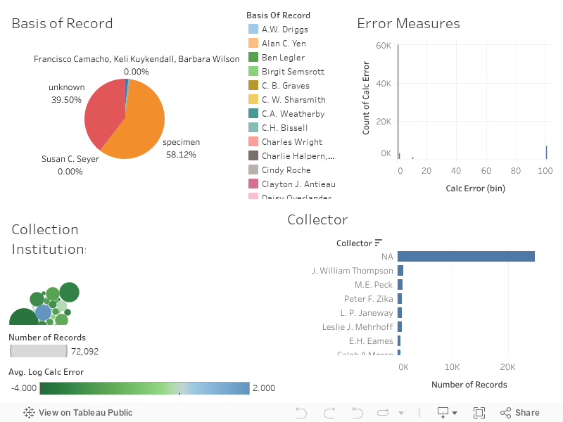
GBIF data providers are using the "Basis Of Record" column incorrectly, as you can see in the colour legend.
When I visualized the collection institutions providing data to GBIF, a data aggregator, I noticed that the error on the Consortium of California Herbia was noticeably poor. I might consider excluding these records from my downstream analyses.
Lastly, I discovered that most of my data points have "NA" as a collector. It is hard to vet the quality of specimen information when no label data is indicated!
I also discovered a few new things about my data that I had not known before. Many of my data points are derived from Carex fossils in California. What implications does this have?
My specimen based records tend to aggregate in very distinct area of the country.
Lastly, altitude data from my specimens are clumped together. This may be a rounding artefact, or perhaps sampling occurs in low lying areas and at the tops of mountains?
Here is the visualization for your enjoyment, embedding possible via my Tableau Public profile:
 |
| The Color, Size, Label, Detail, Tooltip and Shape cards. |
Other features of your visualization can be changed like the colors, sizes of features, shapes etc.
Time to build visualizations!
Dataset
I'll be using a set of data extract from GBIF of Carex spp., a genus found worldwide. In these analyses, I also aggregated BIOCLIM variables from WorldClim, scored habitat variables manually and extracted morphology from the Flora of North America (FNA). I will explore these datasets similarly, and post the final visualizations at the end of the post.
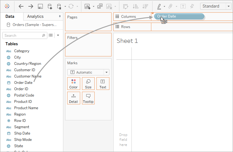
First, open up Tableau and load your data.
Next, hop onto "Sheet 1", a worksheet Tableau guides you to.
GBIF data
Here is a screen capture of my exploration. I experimented with map views, bar charts, and other ways to view the data in this GBIF data export.
Click through to view the sheets I created below:
- Species Maps
- Map of Record Density
- Basis of Record
- Collection Institutions
- Error Measures
- Altitude
- Collector
- GBIF Exploration Dashboard
Data cleanliness:
Before bringing the data into Tableau, I had used R to clip my dataset to data points with country equal to the United States. In Tableau, I quickly learned my R cleaning method wasn't as effective as I thought.
Latitude and longitude artefacts from rounding are also evident, which I saw in my map plot when reducing the mark size down to see density of points. They seem to cluster in a grid pattern!
GBIF data providers are using the "Basis Of Record" column incorrectly, as you can see in the colour legend.
When I visualized the collection institutions providing data to GBIF, a data aggregator, I noticed that the error on the Consortium of California Herbia was noticeably poor. I might consider excluding these records from my downstream analyses.
Lastly, I discovered that most of my data points have "NA" as a collector. It is hard to vet the quality of specimen information when no label data is indicated!
I also discovered a few new things about my data that I had not known before. Many of my data points are derived from Carex fossils in California. What implications does this have?
My specimen based records tend to aggregate in very distinct area of the country.
Lastly, altitude data from my specimens are clumped together. This may be a rounding artefact, or perhaps sampling occurs in low lying areas and at the tops of mountains?
Here is the visualization for your enjoyment, embedding possible via my Tableau Public profile:
Next steps
I hope to publish more software posts soon. Stay tuned!

Comments
Post a Comment